Client
Top National Bank*
Services
Strategy
Wireframing
Year
Summer 2025
Role
Lead Designer
The Project
A Top National bank* engaged our Human Centered Design (HCD) team to facilitate a workshop with leaders and users to identify experience challenges and define opportunities for improved adoption and efficiency..
*This project is protected by a Non-Disclosure Agreement (NDA)
Overview
I co-facilitated a half-day workshop with team members, leaders, and users to define opportunities and challenges in the DevHub experience. The session began with an Alignment Exercise to get participants engaged, followed by a review of pre-workshop survey insights to prime the Creative Matrix activities. In breakout sessions, participants explored five key topics, uncovering challenges and opportunities for improvement. The workshop concluded with a Product Mapping activity, where the group shared desired changes to enhance usability and adoption.
Alignment Exercise
Alignment Exercise
We opened the event with an alignment exercise to get the room on the same page discussing how the team is harnessing the potential of DevHub.
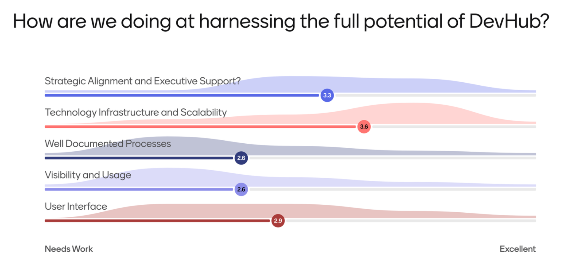
The Results
Participants accessed a live survey on their phones and rated key criteria from 1–5. This surfaced critical challenges across strategy, technology, and user experience: leadership visibility and onboarding were misaligned, technical foundations were outdated, documentation was scattered, adoption was limited by low visibility and fragmented entry points, and the UI was seen as outdated and complex.
Creative Matrix
Creative Matrix
We continued with a Creative Matrix exercise, where I facilitated cross-team collaboration around key “How might we” statements. I captured and organized opportunities and blockers around technology/data and processes/procedures into themes that informed future design iterations

How might we…
One example of a “How might we” statement was: “How might we improve the architecture, navigation, and personalization of DevHub?” This surfaced several themes, including the need for personalized, user-specific experiences such as customizable UIs, SSO-based tracking, and profile-driven views. Participants also emphasized enhanced navigation with improved search and case-based pathways, as well as modernization through a UI revamp, unified design patterns, and embedded tools to centralize workflows. Additional ideas highlighted leadership enablement with role-based reporting and CI/CD tracking, along with process improvements like user-centered design practices, stronger governance to drive adoption, and planned releases to support continuous improvement.
Product Mapping
Product Mapping
We wrapped up the workshop by prioritizing features and visualizing user-specific views through live wireframing, later refined into high-fidelity designs delivered to the client.

Lo-Fi Wireframes
The workshop closed with a group discussion on desired features and UI improvements to enhance DevHub’s usability and adoption. Together, we prioritized features and identified the different views needed for key user groups, including BSAs and Developers. As participants shared ideas, I sketched low-fidelity wireframes on the whiteboard to capture the discussion in real time. After the session, I refined these into high-fidelity Figma designs, which were delivered to the client as a clear next step.
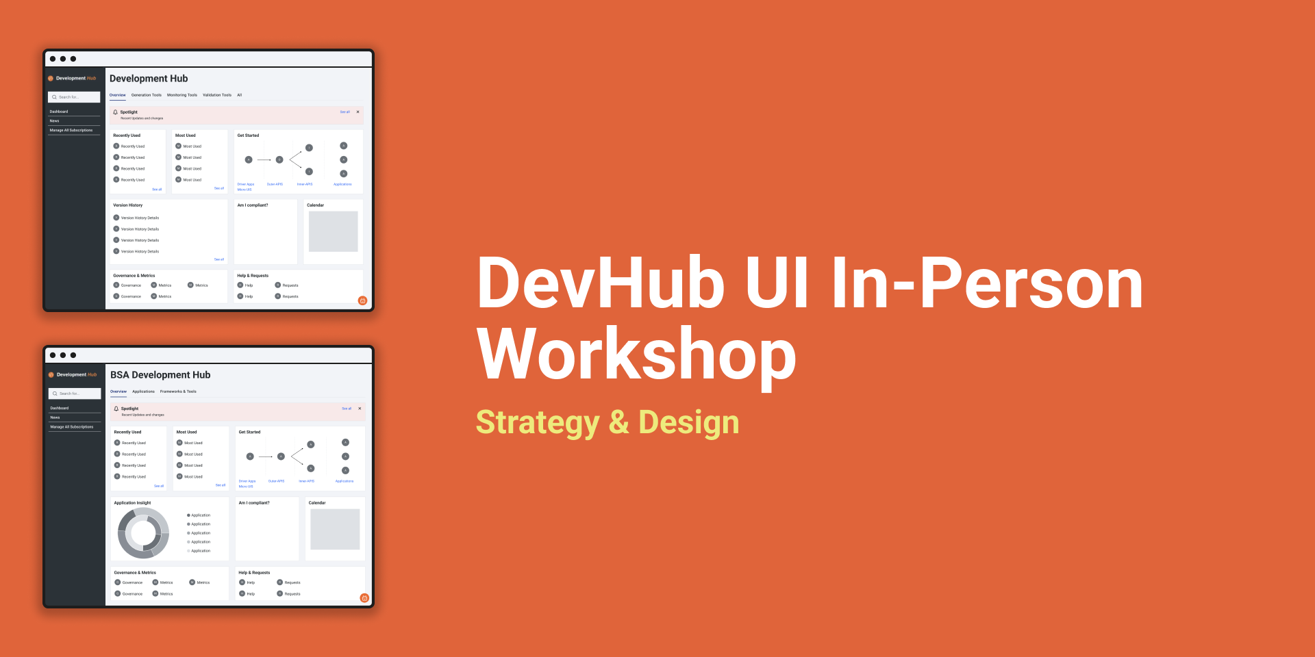
High-Fi Wireframes
As part of the deliverables, I transformed workshop sketches into high-fidelity Figma screens tailored for DevHub’s two core user groups (BSAs and Developers). By translating participant priorities into actionable design solutions, I delivered concepts that not only addressed usability challenges but also aligned stakeholders on a clearer vision for improving adoption and overall user experience.


BSA View
For BSAs, the redesigned screen emphasizes Application Insights, bringing key metrics and status updates into one centralized view. Paired with easy access to relevant applications, this personalized layout helps BSAs monitor performance, identify issues, and act quickly
Developer View
For Developers, the redesigned screen introduces improved categorization of tools within a clean, tabbed interface, making it easier to navigate and access the resources they use most. Personalization highlights frequently used tools, while added visibility features, like upcoming events and spotlight updates.